In a Friday Shakeup, 97.1 The Freak Changes Formats and Fires Radio Legend Mike Rhyner

Less than two years removed from its 2022 launch, 97.1 The Freak is apparently no more. According to at least two reports on Friday, the station’s owner, iHeartMedia, announced a format change and several firings on Friday.
Athlon Sports’ Richie Whitt reported that employees were summoned to an emergency meeting to discuss The Freak’s unremarkable ratings over the last 18 months, since the frequency abandoned its former identity as The Eagle and longtime status as a home to heavier rock music. Whitt, citing unnamed sources, was the first to relay the news that staff will be let go and that a “change in direction” is coming.
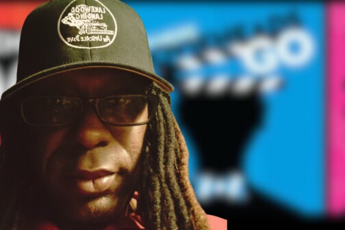
Listeners began speculating on social media. A video was posted on a fan-run Facebook page that appears to show the station’s flagship voice, Mike Rhyner, pulling up a yard sign promoting the station and then saying, “Thanks, y’all.”
Rhyner, a Texas Radio Hall of Famer and one of the founders of The Ticket, came out of retirement to join the new station and its “free-flowing” talk format. (He talked about that decision in this episode of EarBurner.) He confirmed to the Dallas Observer that he and the rest of the on-air crew for his afternoon show, The Speakeasy, were fired Friday, including Jeff Cavanaugh and Julie Dobbs. Rhyner also said that staff was told that the station would revert back to its original rock programming and Eagle branding on Monday.
“I know that everyone on our show is gone,” he told the Observer. “I’m not sure about the others, but I would imagine the same thing holds true for them,” referring to the rest of The Freak’s lineup, which included The Downbeat with Mike Sirois, Danny Balis, and Kevin Turner and The Ben and Skin Show with Ben Rogers and Jeff “Skin” Wade. “Like I said, this was a thing where that radio company, especially the branch of it here in Dallas-Fort Worth, is not well equipped to handle us and what we did, and they really weren’t into it at all.”
The station is also the Dallas Mavericks’ radio broadcast partner, with Chuck Cooperstein providing play-by-play. Judging from his tweet this afternoon, tonight’s playoff broadcast will air.