A Voter’s Guide to the 2024 Bond Package


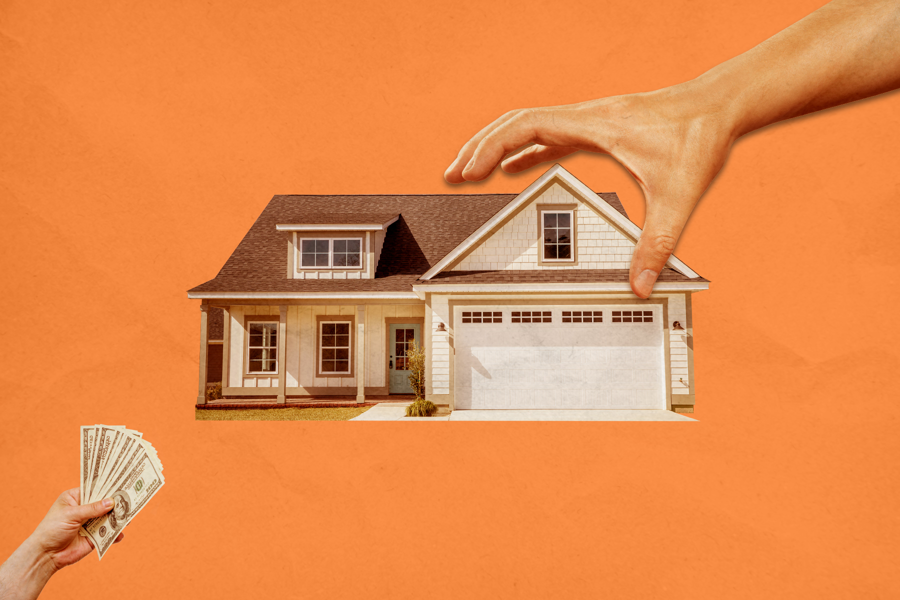
Voters are being asked to give Dallas permission to borrow $1.25 billion to address everything from the city’s aging streets to improving drainage, adding new parks, and funding a new police training center. Should the bond’s 10 propositions pass, roughly 800 items will be started in tranches over the next five years. City staff triages projects based on various factors, including urgency and equity.
While the total amount of money for each proposition is set, the project list could change. The city’s Bond and Construction Management Department said last month that the Council could also modify the scope of specific projects or adjust the money allocated for those projects.
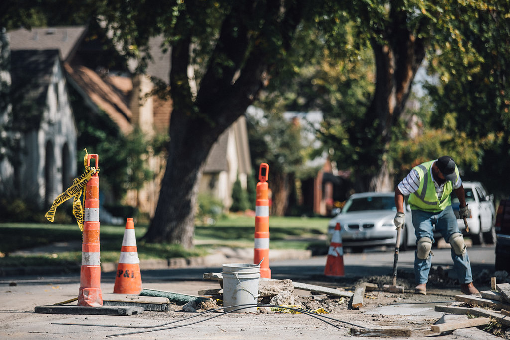
That’s what happened in some cases with the 2017 bond. Voters approved borrowing $1.05 billion across 10 propositions that included many of the same buckets as this year’s bond election. City staff says that about 96 percent of the 1,400 projects on the 2017 list are either complete or have been put out to bid. Some of the remaining projects were slated to begin bidding and construction in 2023, the final tranche of the last bond.
Some projects were canceled (such as plans for 35 rental units in the Bonton neighborhood), and the city will reallocate that money for similar projects that fall under the same scope. Other projects were slower to complete because of pandemic-era supply chain disruptions and labor shortages. With the May departure of City Manager T.C. Broadnax, a new chief executive at City Hall will be charged with overseeing the program’s implementation.
If any proposition fails to pass, the city won’t be able to legally issue a certificate of obligation to fund projects in its category for the next three years. That could create choppy waters if, for instance, a storm destroyed a library after voters shot down Proposition D, which will pay for two new libraries and improvements on nine others. The city would likely have to pay for such an emergency through the general fund.
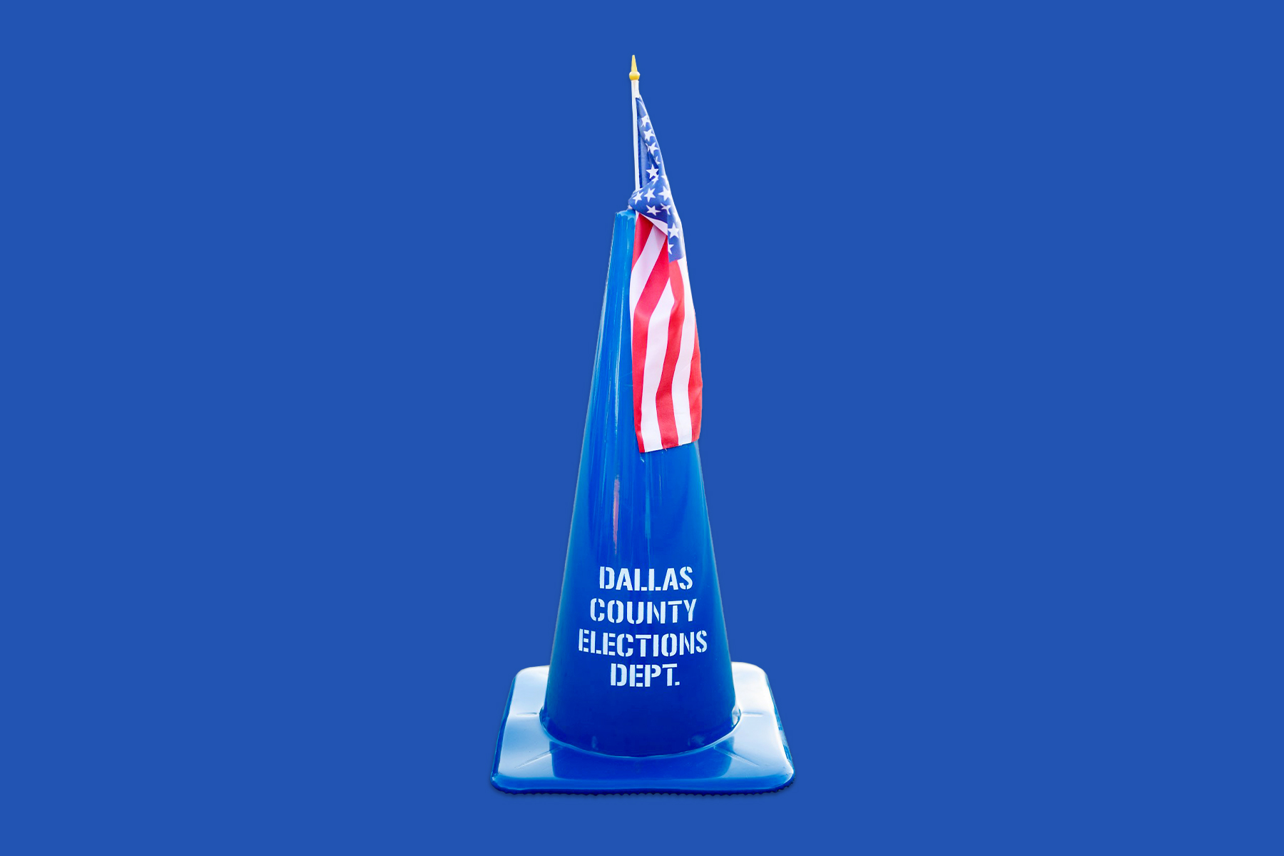
Early voting began April 22 and runs through April 30. Election Day is May 4. Head here to find your polling place. Below, we walk through each proposition to explain what you’re actually voting for.