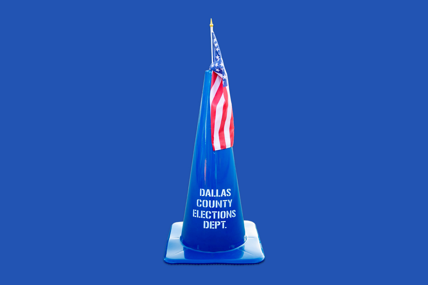
Poll: Dallas Is Asking Voters for $1.25 Billion. How Do You Feel About It?

Early voting for municipal elections began Monday, and a $1.25 bond package will be on your ballot in the form of 10 propositions.
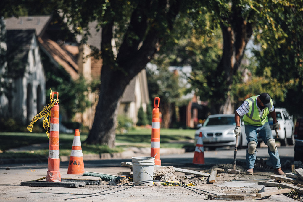
Voters are asked to give the city permission to borrow that money with interest, which will address everything from the city’s aging streets to improving drainage, adding new parks, and funding a new police training center. Those projects—all 800 or so—are scheduled to begin at some point over the next five years.
It’s important stuff that you’ll see in your neighborhood. It might be a new library, new spraygrounds, or a better road. We dug into the projects and the bond language to create this guide to help voters better understand what they’re voting for—or against.
With that in mind, we’re asking our readers to weigh in by taking the poll below. Let us know what you think, and stay tuned for the results. Early voting continues through April 30. Election Day is May 4.